I've been putting off this studio color revamp for quite some time. In fact, it's one of the last rooms in my home to be painted. Awhile back, I shared with you the disaster zone that was my office and how I used craft hutch organization to corral everything into place. I've been getting more work done in this room, but to be honest, I still hated being in there.
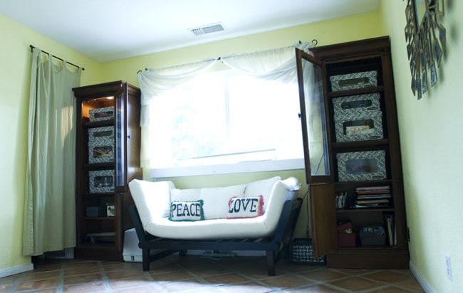
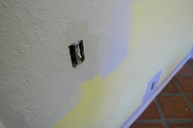
So. Much. Yellow. I could hardly think surrounded by that color. And with this area serving more and more for photography (with creative teams being cut back everywhere, that skill is taking an increasingly large role in my editorial work), I needed to find a studio color that would serve as a decent backdrop and a calming place for my mind…and not turn every photo that vibrant hue.
What's the Best Studio Color?
I've been surrounded by enough photographers in my life to know that “18% Grey” holds a magical, mystical place in photography lore.
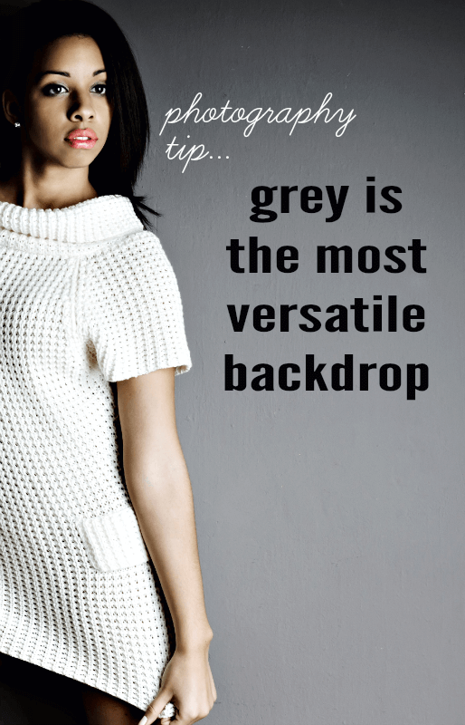
The idea is that if a photo has the perfect balance color made up of equal levels of R, G and B directly in the middle of black and white tones, you can use that color to properly balance colors throughout the rest of the image.
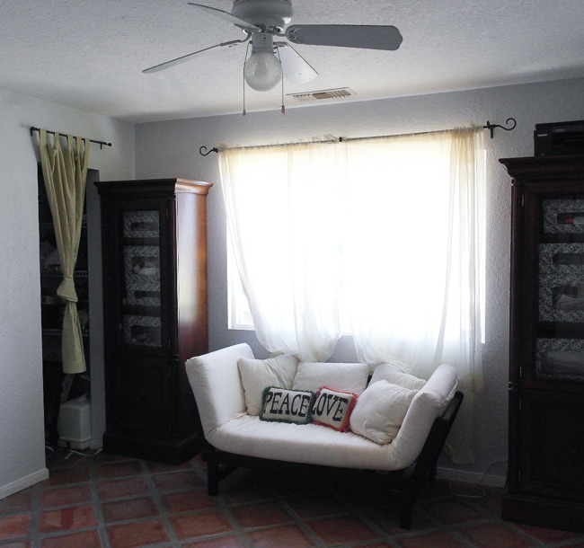
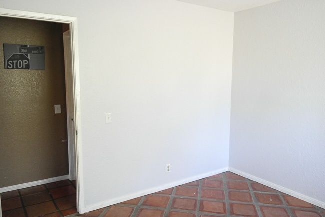
With a full grey studio color, you can make the backdrop appear white with back-lighting, black by feathering the light or turn it any color with a gel. I'll admit that for my intermediate home photography purposes, my studio color choice was a little less scientific: I didn't want to use harsh white (too much reflection to deal with and too hard to clean) and I couldn't go full black (I'm not a vampire). I finally settled on BEHR's Marquee White Lie color and it is the perfect neutral grey. It's deep and bold and somehow bright all at the same time. I never thought I'd rave so much over a studio color. I'm so obsessed with it, in fact, that I'm considering painting the entire exterior of our house with it.
I have plans to add all sorts of fun accents. Peach crown molding, curtains with pops of color…for now, I just wanted to show what a huge difference paint can make.
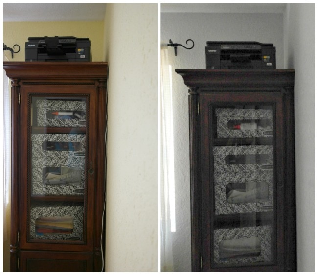
Anyway, one of the big things that held me back from making my studio color update was that I knew just how difficult it can be to cover up a bright color. I don't have the patience for layers and layers of primer. BEHR’s Marquee line can offer one-coat coverage with the proper preparation and tools, and it would have a totally scrubbable finish for durability in my busy home.
As soon as I started rolling it on, I was pretty dang impressed. While I did use two coats, that was largely because I have an edger that spreads paint a little too thin (I'm going to chalk this up to user error. I hate edging). With a steadier hand, I unquestionably could have covered that ugly yellow up in one coat!
The saltillo flooring clashes completely, but I'll make my peace with it for now. We're reserving this corner for something special.
Stay tuned.
Great pictures, I love those pillows!! Can’t wait to see the rest.
Love it! Isn’t the Behr Marquee paint amazing? We only needed one coat in the kids room when we redid it a few weekends ago and they had bright greens and yellows in there!
I love your decorating. We are doing our basement now and you have some great suggestions! I love the couch with pillow!
I totally think gray is the perfect color for every design scheme! Your studio looks so cute! 🙂 Have a fabulous week 🙂
xo,
Stephanie
Diary of a Debutante
http://www.thediaryofadebutante.com
I adore gray. I painted my daughter’s bedroom gray and my own bedroom is a version of a lavendar-gray. I think it’s the perfect backdrop… not just for photos, but for any color and for any style.
Wow! I really like the change! I never would have even considered a grey color at all! But it looks fantastic. I may have to repaint my office this color when we get moved in!