I love seeing the hot paint palettes as they're released every year. Decor is constantly in flux and it's interesting to me to watch the trends come in and out each season. Designers have such a specific talent, invigorating new life into a room with deep hues or bright colors that feel fresh.
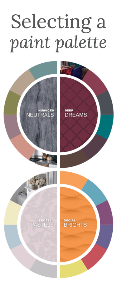
BEHR just released their 2015 color trends, with four paint palettes that prove exactly how unexpected and exciting colors can flow together. Working with them over the past year, I've learned that it's ALL about balance. A strong accent wall can be evened out with neutral tones throughout an adjacent hallway. A boring room can be pepped up with some splashes of coordinating color throughout the furniture…as long as you take time to envision it as a whole.
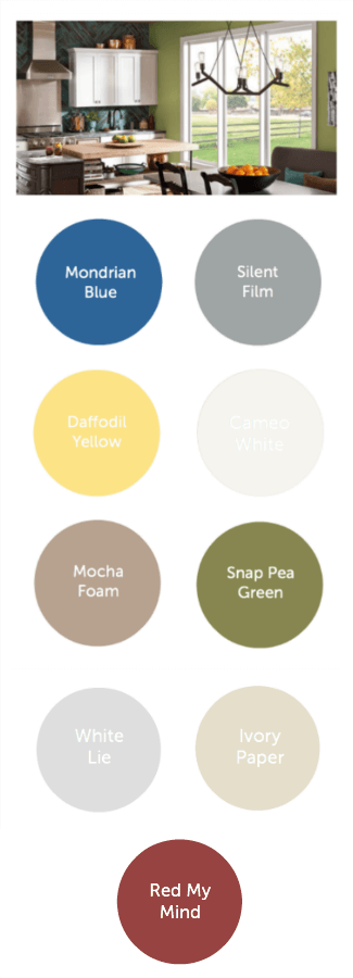
Our (Evolving) Home Paint Palette
When we moved to our new house two years ago, we knew nothing about selecting a paint palette and were so overwhelmed with all the bright colors already in our home that we simply focused on toning everything down. That left us with a home interior that is certainly more subtle, but not exactly coordinating…at all.
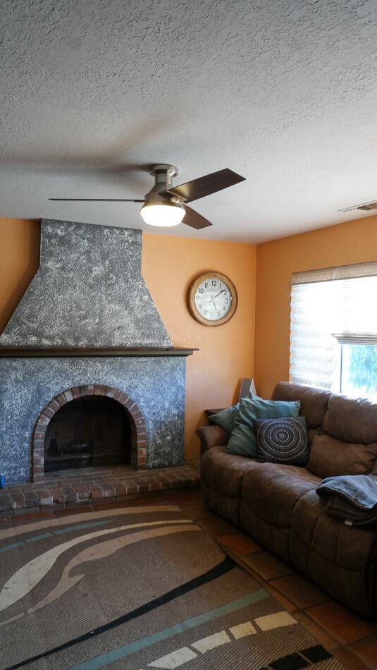
We enter through the peach-colored living room, with hints of dark grey and sea-colored blue. As it stands alone, I love this room. But it's tragically difficult to take pictures in here hanging out as a family or with friends. Everything winds up looking a strange shade of yellowy orange from the light reflecting off the walls.
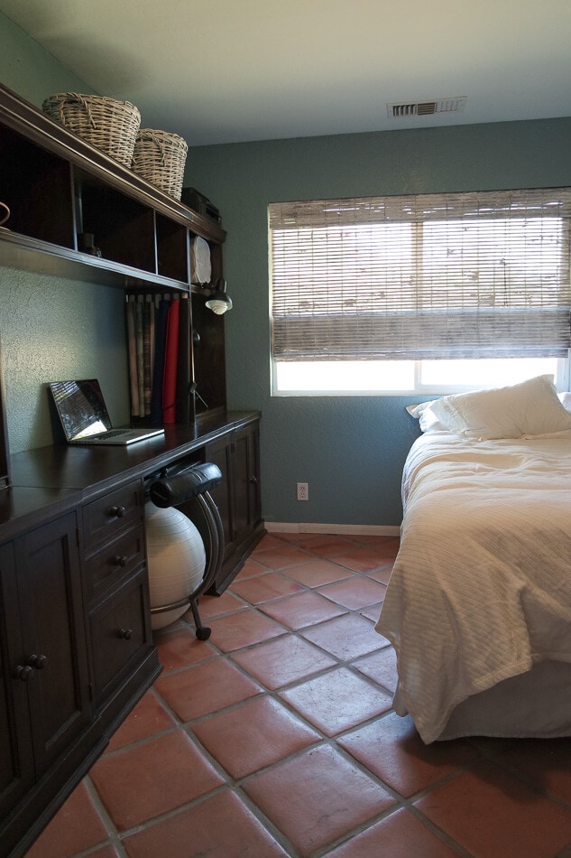
The soft blue is continued into my office…another space where the light reflects oddly and makes photo-taking a challenge.

It all clashes against the bright yellow background of our adjacent kitchen. This is a house-brand paint color that is closest to BEHR Marquee's Daffodil Yellow. For now we plan to keep the yellow and incorporate a lot of bright white and earthy tones in here to balance it out.
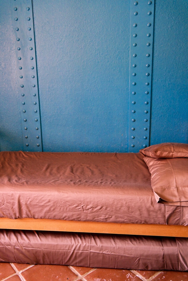
Back through the mocha-colored hallway, the boys have a brightly-colored room that is one of the first sights from the front door. It's hard to capture the vibrance of this shade on film, but it's closest to BEHR Marquee's Mondrian Blue. And it TOTALLY doesn't go with the peach living room or the greenish-blue of my office, all of which are visible from the same spot at our front door.
So after sorting out our exterior paints, we're doing a little interior color revamping in the coming year. This time we're more mindful to work through a whole home paint palette, considering how each room looks in view of the others. When choosing a paint palette, it's always helpful to start with the most vibrant colors, pulling perhaps from a favorite rug or must-keep painting. We have those initial color choices made for us in the boys' room and the kitchen.
We'll be keeping the bright blue and yellow that is already balanced out by mocha in the halls and gray throughout some of the other rooms. That primary All-American feel will be continued with some accenting greens and reds – more pops of color to show a little personality – but heavily balanced with earthy shades as well as stone and wood elements. Hopefully we'll wind up with a home that feels more cohesive.
Do you follow color trends? What are your favorite picks?